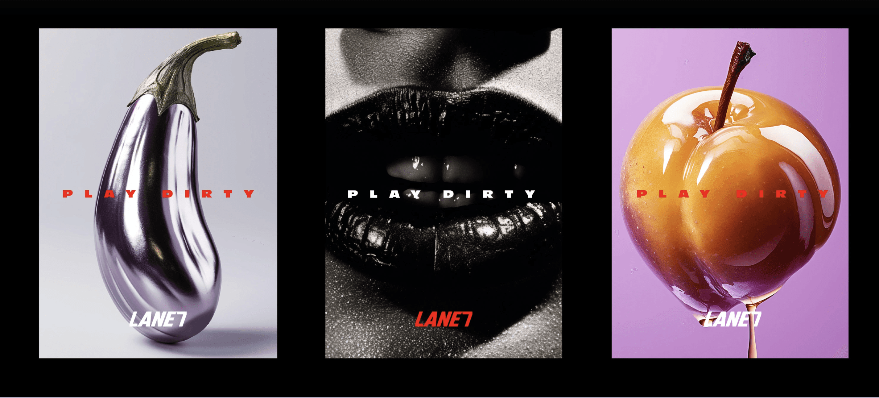
Play Dirty
Play Dirty is an adult entertainment concept that transforms the traditional arcade into an immersive social experience. The project focused on extending the brand beyond its visual identity, creating a cohesive system that translated its bold personality across physical spaces and customer touchpoints.

PROJECT INFO
The Challenge
The challenge extended beyond applying an existing identity across physical assets. Every customer interaction, from entering the venue and navigating the space to ordering food or engaging with the arcade, needed to communicate the same personality while maintaining consistency across a diverse range of touchpoints.
The objective wasn't simply to design individual assets, but to create a connected brand experience that customers could instantly recognise, navigate, and remember.
My Contribution
I was responsible for translating the brand identity into a cohesive physical experience. Working across environmental graphics, packaging, and branded applications, I developed a visual system that ensured the identity remained consistent, recognisable, and adaptable across different environments and customer interactions.
Design Thinking
Every application was approached as part of a larger brand ecosystem rather than an isolated design exercise. Instead of asking how each asset should look, I focused on how every touchpoint could contribute to a single, unified brand experience.
Three principles guided every design decision:
Consistency
Every touchpoint should reinforce the same visual language, regardless of medium or scale.
Immersion
The physical environment should become an extension of the brand, allowing customers to experience the identity rather than simply observe it.
Personality
Bold typography, expressive colour, and playful messaging were used to create memorable interactions while preserving clarity and functionality.
Bringing the Brand to Life
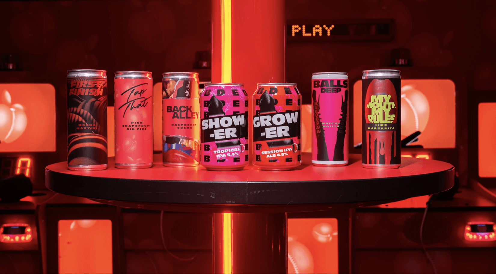
The visual identity was translated across environmental graphics, packaging, signage, and promotional materials to create a seamless customer journey.
Rather than functioning as independent design outputs, each application contributed to a unified system where typography, colour, messaging, and graphic elements worked together to strengthen recognition and reinforce the brand's personality across every touchpoint.
Outcome
The project resulted in a cohesive brand experience where physical environments, packaging, and customer touchpoints functioned as one connected system. By extending the identity beyond individual deliverables, the brand became more immersive, recognisable, and memorable throughout the customer journey.
Key Takeaway
People rarely remember individual design assets; they remember how a brand made them feel. This project reinforced that consistency across every touchpoint is what transforms a visual identity into a memorable brand experience.